Using Color Theory to Elevate Your Fly Tying Game
Ready to talk about colors? I was recently working on a project that required me to pick a tan color… well… as it turns out it was much harder than I could have first anticipated. Not only are there a seemingly infinite number of colors of tan, but it also turns out that what I see as tan on my monitor may not be the same as the color on your phone screen, or of a product in hand! Who knew! I sure didn’t.
This set me on a color journey honestly I really wish I hadn’t started. But I will likely spend many more months geeking out on this, and I wanted to share what I have been learning thus far.
At it’s core color theory is the study of how colors interact with each other and how they can be combined to create visually appealing or effective designs. It provides guidelines for choosing and pairing colors to create contrast, or achieve harmony.
Here are a few of the main color schemes.
Complementary Colors – 2 high contrast colors, not matching, attractor style flies
Complementary colors sit directly opposite each other on the color wheel. Examples include blue and orange, red and green, or yellow and purple. When paired together, these colors create a high-contrast, vibrant effect that stands out.
Split Complementary Colors – 1 main color and two complementary colors
Split complementary is a variation of the complementary scheme. However instead of pairing one color with its direct opposite, you use the two colors adjacent to its complement. For instance, if your base color is green, the split complementary colors would be red-orange and red-violet.
Analogous Colors – 3 matching colors, more natural style flies
Analogous colors are next to each other on the color wheel, such as green, blue, and teal or orange, yellow, and red. These colors create a sense of harmony and are often found together in nature.
Triadic Colors – 3 high contrast colors, not matching, attractor style flies
Triadic color schemes involve three colors evenly spaced around the color wheel, such as red, yellow, and blue or orange, green, and purple. This scheme provides a vibrant and dynamic look due to the equal contrasting spacing on the color wheel.
Monochromatic Colors – variations of a single color
Monochromatic schemes use variations of a single color, including its tints (lighter versions) and shades (darker versions). This creates a cohesive and understated look.
Does every fly need to follow one of these rules? Of course not. But if you are trying to decide on what colors to pick for your next pattern, choosing from amongst one of these might just help you!
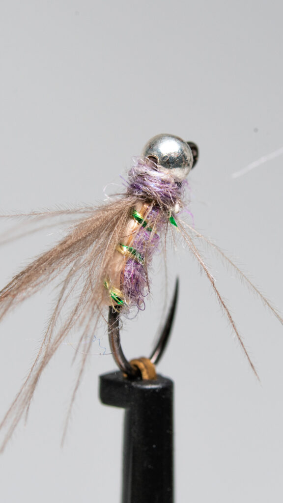
One of my favorite attractor style nymphs in the spring is a purple Duracell. I like it because depending on the water clarity I will vary just how purple the body is. Often when I tie this fly I’ll use a monochromatic color scheme using only purple materials. But for this article I wanted to try a split complimentary color scheme to ‘really mix things up’.
Starting with Senyo’s Laser dub in Lavender I found the split complimentary colors to be light tan, and a light green. As I looked through materials I settled on a tan biot and green sparkle braid to use as ribbing.
While there may not be a whole lot of crazy uniqueness with this fly, I put way more thought and time into this color combination than the time it took me to tie, and that makes it unique to me.
Hope you learned something too! Happy coloring!
Modded Duracell
Materials list:
– Senyo’s Laser Dub – Lavender
– Tan Biot bottom
– Veevus Sparkle Braid – Iris

